


Why is accessibility important to me?
It started when I was 5 years old, during my first July 4th family reunion. I noticed one of my cousins was different. I asked my Mom about him. She told me my cousin, and many of my relatives were deaf. Playing with him, I realized I had to slow down and make sure we understood each other. This small change had a large impact on our ability to engage and cooperate.
Why is accessibility important to SnapLogic?
Making our product more accessible improves the product for everyone. In addition, many state and local governments include accessibility as criteria during product evaluation.
Thoughtfully considering how we expose status and errors makes the product clearer for all users. Having generous sized targets for buttons and icons means that users need to put less effort into accomplishing a task. Making sure that there is high contrast between colors that convey information allows the product to be useful in dim light. Adding meaningful attributes makes it easier to use with a screen reader or another text-to-speech tool.
The useability of a product is affected by many factors. Paying attention to these issues means there is less friction between our product and our users.
At SnapLogic, some of the things we consider when designing user interface elements:
- All elements a user can interact with need semantic attributes. Semantic attributes can include:
- Title, the text that shows as a tooltip when you hover over an image or link. This provides valuable information for screen readers
- Name, Label for=”” attribute, gives the user additional information about form elements
- Every link has a semantic value. The highlighted text of a link should describe the purpose or destination of a link. Never use “Click here”
- Use ARIA attributes to make web content and apps more accessible to people with disabilities. Many library components already include this ability if you enable it
- Make sure any information that is conveyed using color is also conveyed in other non-color attributes
- Make sure there is enough contrast between foreground and background
From Mozilla Developer Network, HTML: A good basis for accessibility: “Semantic HTML doesn’t take any longer to write than non-semantic (bad) markup...” Likewise, It doesn’t take any more time to build accessibility into the SnapLogic product. We simply need to pay attention.
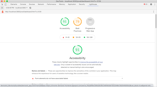
We also use tools to measure how successful a design is, and where we need to improve.
Some of these are built into every modern browser. For example:
- Chrome Lighthouse will give you a score, and point out specific issues you can address.
- Firefox Accessibility Inspector will simulate how a page will look to users with color vision deficiency.
Here is what the dashboard page looks like to someone with Protonopia (unable to perceive the color red)
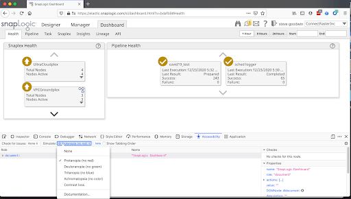
It also has tools to highlight issues with contrast, keyboard, and text labels.
In addition, W3.org has a wealth of information to help designers, developers, testers, content writers, and others make the web more accessible to people with disabilities.
As I realized that July 4th weekend years ago, making small changes to accommodate others will bring big dividends. Accessibility is not only the right thing to do, it makes the product easier to use for everyone.