


The total number of confirmed COVID-19 cases, worldwide, is now approaching two million.
Many resources are available on the web to track and understand the growth of this pandemic, including the dashboard operated by the Johns Hopkins University Center for Systems Science and Engineering. This dashboard is backed by a data repository published on GitHub. The source data is high quality but requires significant structural transformation for an effective visualization. The SnapLogic Intelligent Integration Platform handles the transformations easily.
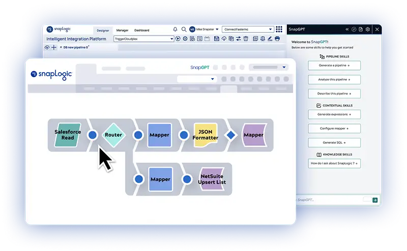
In this blog, I will walk through the construction of a SnapLogic pipeline, which reads a subset of this data from the GitHub repository, filters the data for a few countries, and transforms the data so that it can be viewed with a line chart using SnapLogic’s DataViz feature. If you want to follow along, please go to our community to download the pipeline illustrated in this post. There are links throughout this blog to relevant sections of the SnapLogic Product Documentation, where you’ll find more information.
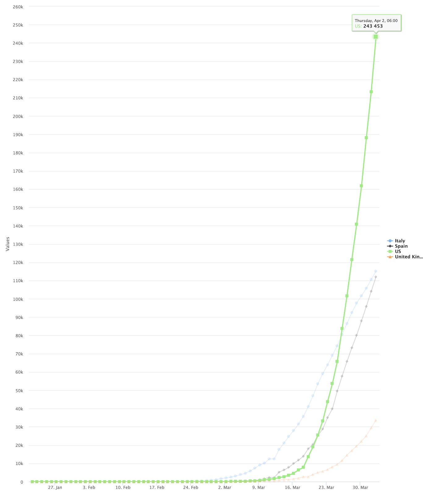
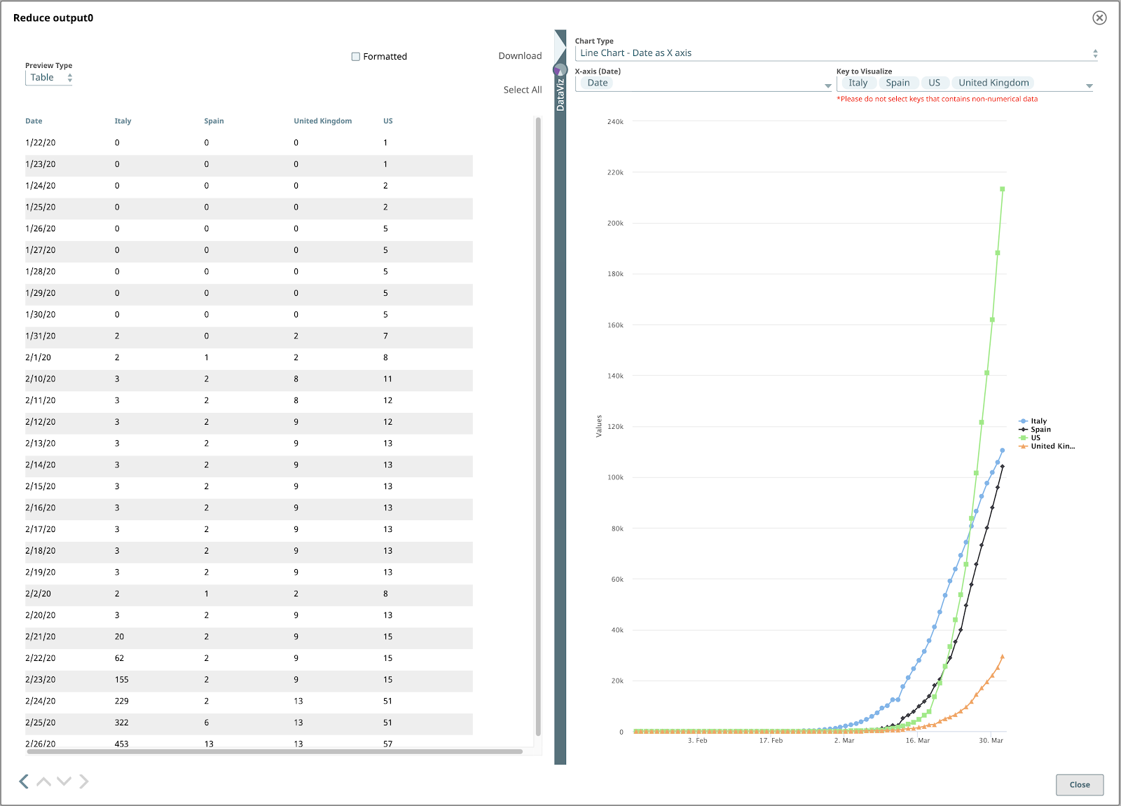
The final output will look like this:
Examine The Source Data
Our source data is JHU’s time_series_covid19_confirmed_global.csv file. This file contains time-series data for the total confirmed COVID-19 cases, by country/region, and is updated every day.
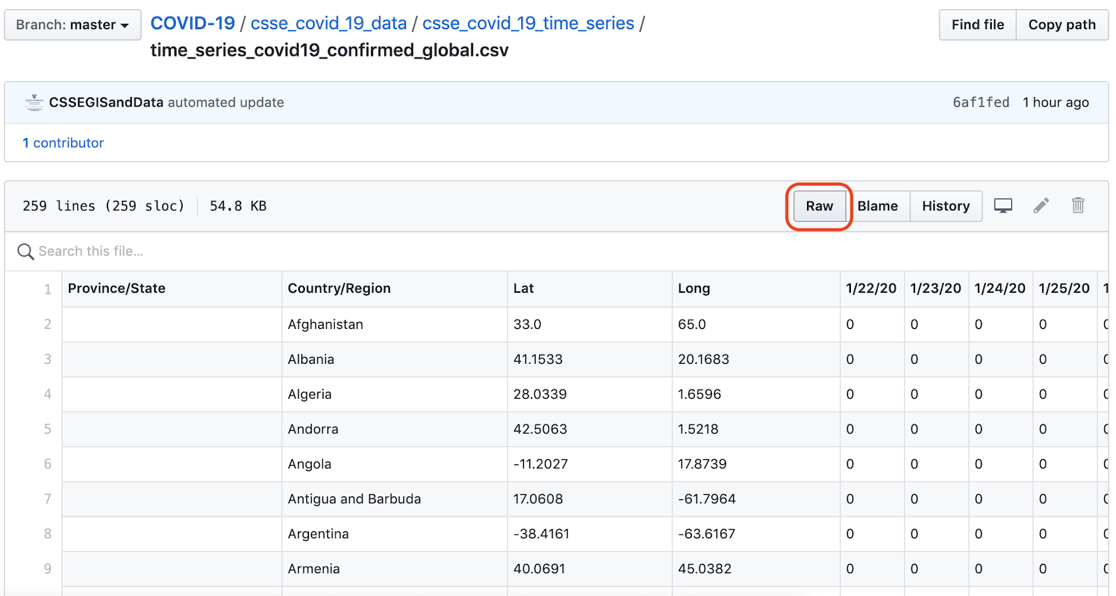
GitHub’s Raw button in this view is linked to the URL for the raw CSV file.
Build The Pipeline
Here’s an overview of our SnapLogic pipeline to read and transform this data:
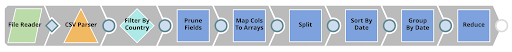
Let’s walk through this pipeline, Snap by Snap.
1. File Reader & CSV Parser
The first two Snaps in this pipeline demonstrate a very common pairing:
- A File Reader to read the raw data, configured with the raw file’s URL.
- A Parser Snap specific to the file’s data format, in this case CSV.
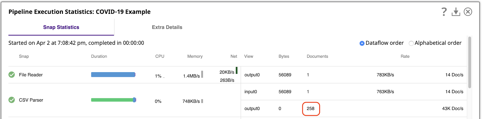
It’s important to understand how much data we’re working with. We can do that by running the pipeline and then viewing the Pipeline Execution Statistics, which shows that the CSV Parser generated 258 output documents, one per row of the CSV file.
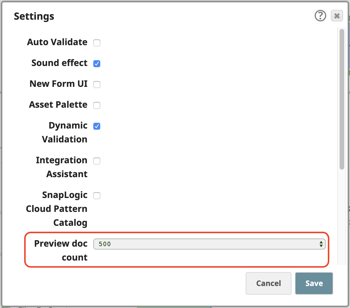
SnapLogic platform allows you to process data even in preview mode, as you are building your pipelines. To easily work with these 258 output documents in preview, open the Settings of the Designer and change the Preview doc count to 500:
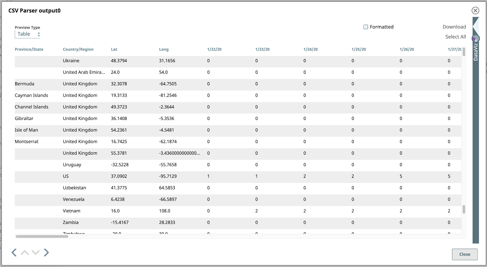
Now if we validate the pipeline, we can preview all of the CSV Parser’s output documents. The default Table view is the best format to show this data given its tabular structure.
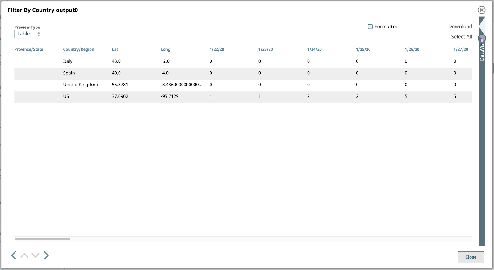
2. Filter By Country
Next, let’s filter this data to find the rows (documents) corresponding to just the four countries we’re focusing on for this example. The countries are the US, Spain, Italy and the UK.
Use a Filter Snap, configured with an expression using SnapLogic’s expression language, which is based on JavaScript, but with additional features to work with SnapLogic documents. This expression is evaluated for each input document as true or false. If the expression evaluates to true for a given input document, it will pass through as an output document of this Snap, if false, the document will be skipped.
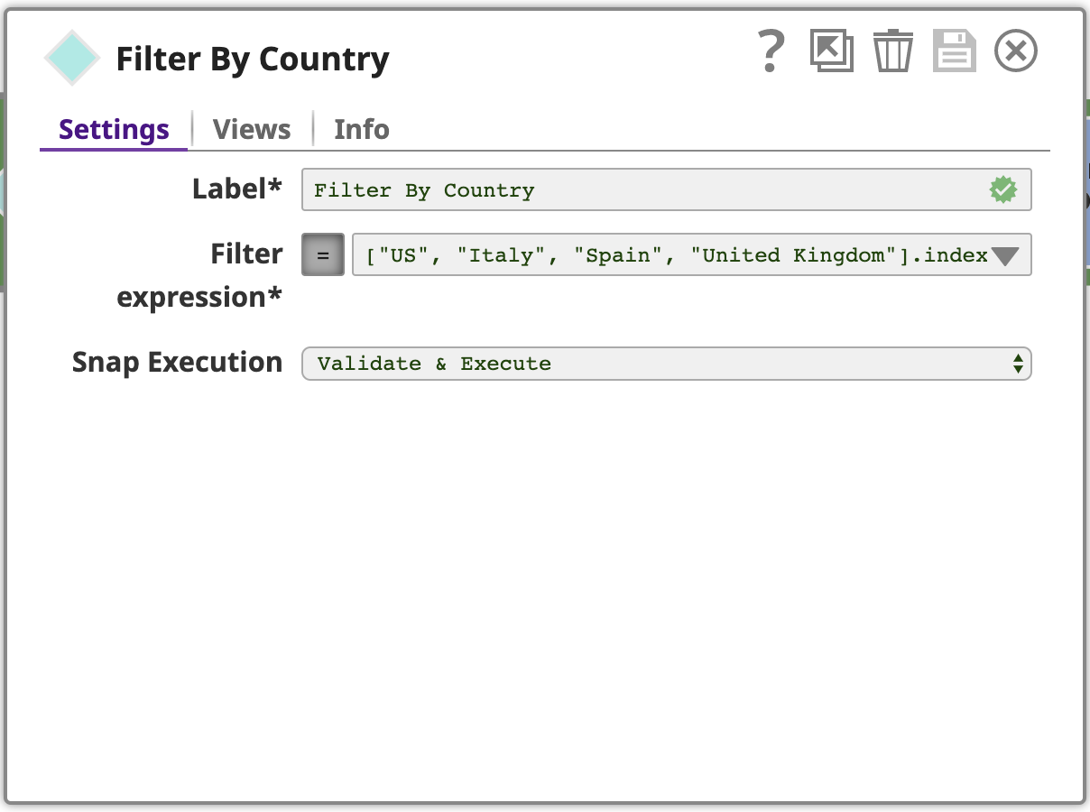
To see the full Filter expression, click the down arrow and then the expand editor icon to open the Expression builder:
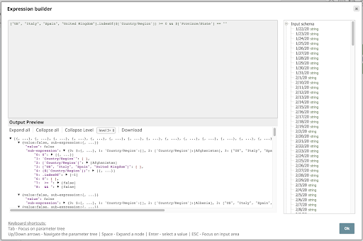
Let’s take a closer look at this expression:
[“US”, “Italy”, “Spain”, “United Kingdom”] .indexOf($[‘Country/Region’]) >= 0 && $[‘Province/State’] == “”
This expression uses an array to specify the countries of interest and the indexOf operator to test whether the Country/Region value is an element of this array. It also tests whether the Province/State value is empty, since we’re not interested in rows with a value for that column.
If we preview the output of this Snap, we see the four rows (documents!) of interest:
3. Prune Fields
Next in the pipeline is a Mapper Snap, by far the most powerful and frequently used Snap in SnapLogic. Here we use the Mapper to implement another typical pattern used in a pipeline of this nature: filtering the columns of the data, which we’ll call fields or keys since each document is represented as a JSON object. Let’s look at the Mapper’s configuration:
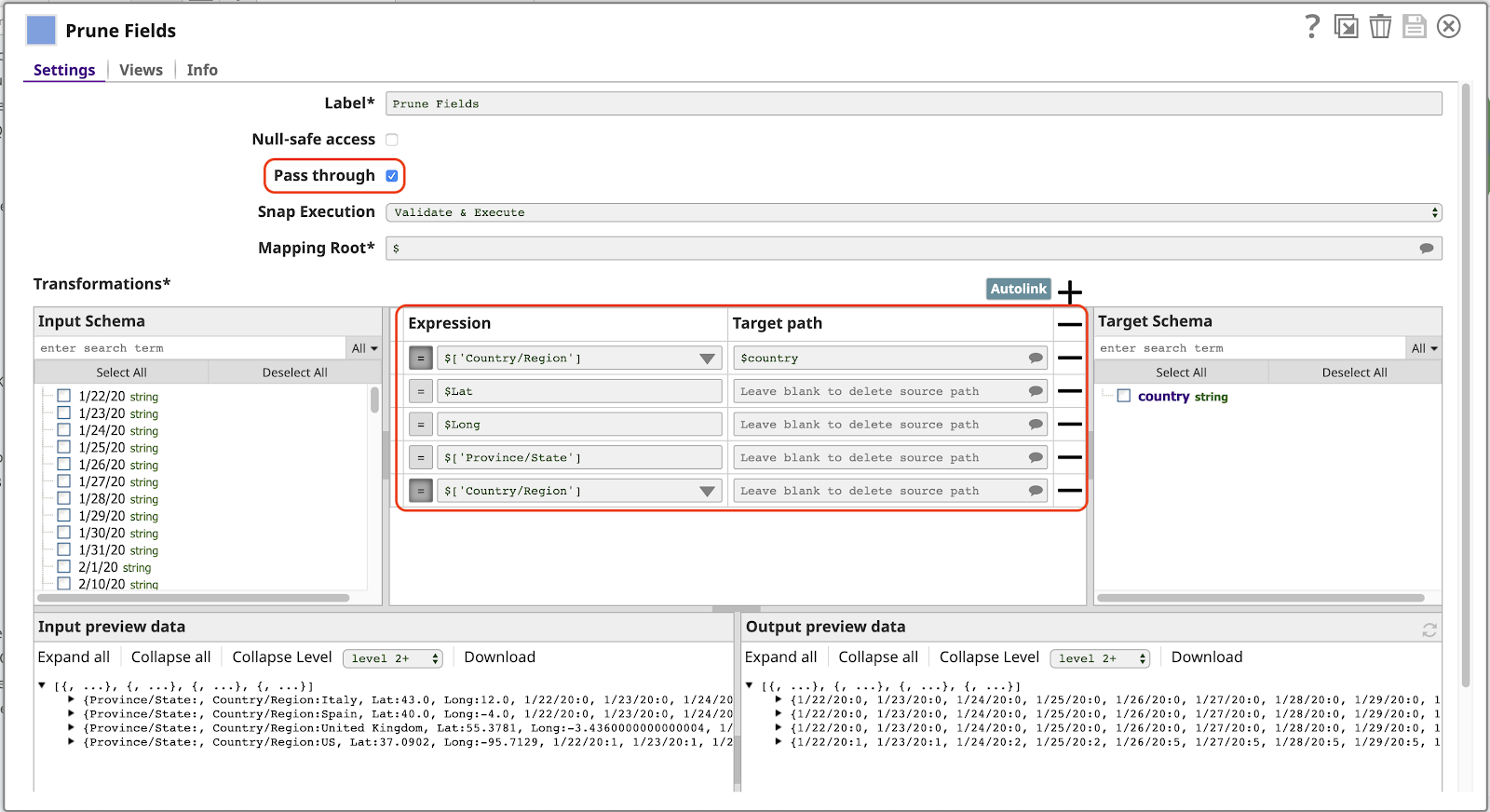
Note the following about this configuration:
- The Pass through setting is enabled. This allows all fields to pass through by default, without explicitly mapping them, including fields corresponding to dates (1/22/20, etc). This means the output will automatically include new data for additional dates the next time we run this pipeline.
- The first row of the Transformations table maps the value of the Country/Region field to the name country in the output. The presence of the / character in the original name makes it invalid to use the expression $Country/Region. We would have to use the longer alternative syntax $[‘Country/Region’], which is not desirable. With this mapping, we can refer to this value simply as $country.
- Any row that has an Expression but no value for Target path will be deleted from the output. This is only needed when Pass through is enabled. Note that we must have a row for the Country/Region field here again, otherwise the value for this field will appear twice in the output document, as Country/Region (because Pass through is enabled) and as country, as specified by the first mapping.
Here’s a preview of this Snap, with just the date fields and the country field to the far right:
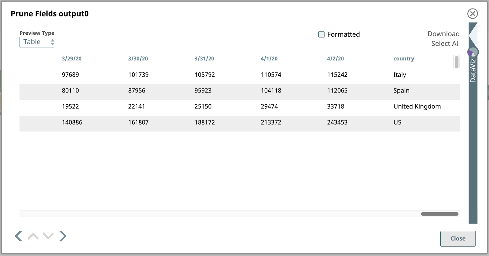
Let’s take a closer look at this output. Each value under a date column in this table is the total number of confirmed cases on that date in the corresponding country in the right-most column. This is the data we want to represent graphically, however, we first need to flip the structure so that the columns become rows. This will require more advanced mapping and expressions.
4. Map Columns to Arrays
Next in our pipeline is another Mapper:
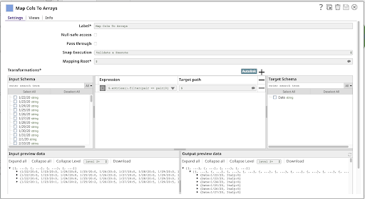
This has a single Expression:
$.entries().filter(pair => pair[0] != ‘country’) .map(pair => { Date: pair[0], [$country]: pair[1] })
Let’s break this down.
$.entries()
This sub-expression will produce an array of the key/value pairs in the object, where each pair is a subarray with two elements: the key and the value. You can see this result using the sub-expression feature of the Expression builder:
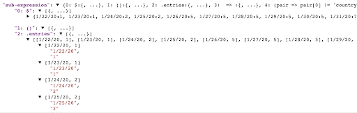
.filter(pair => pair[0] != ‘country’)
This sub-expression will filter the array of key/value pairs produced by entries, resulting in a new array of the pairs, which match the callback function given as its argument. In the screenshot above we’re seeing the first few pairs of the document containing the US data: [“1/22/20”, “1”], [“1/23/20”, “1”], [“1/24/20”, “2”], etc. If you look back at the Prune Fields output, you can see the final pairs in this row: [“4/2/20”, “243453”], [“country”, “US”]. Our filter function will match all but the last pair, where pair[0] == “country”.
.map(pair => { Date: pair[0], [$country]: pair[1] })
The input to this map sub-expression is an array of the key/value pairs representing each date and the case count for that date: [“1/22/20”, “1”], …, [“4/2/20”, “243453”] for the US row.
The map function returns a new array where each pair will be transformed by the expression to the right of the =>, which is an object literal resulting in an object with two properties:
- Date: pair[0] results in a property named Date containing the first half of each pair (the date value).
- [$country]: pair[1] results in a property whose name is the value of the expression $country, and whose value is the second half of each pair (the case count).
For the last pair of the row of US data, the map function will produce an object like this:
{“Date”: “4/2/20”, “US”: “243453”}
This is much closer to the form we need to start plotting points on a chart.
When you change the Preview Type to JSON, here’s the output preview of the Map Cols To Arrays Snap:
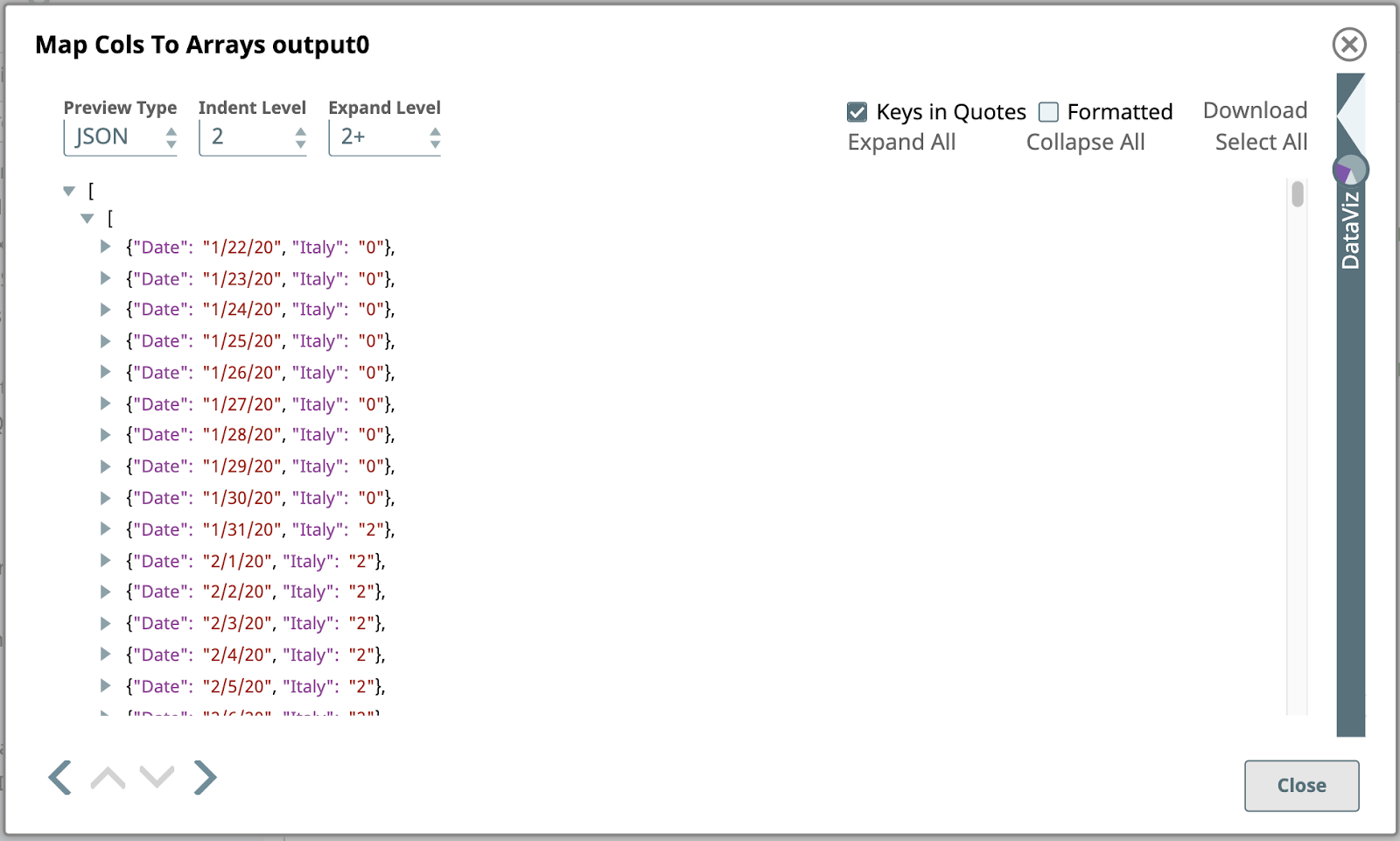
This is a partial view of the first output document of this Snap, created by transforming the first input document containing the data for Italy. Unlike the input document, which was a simple JSON object consisting of name/value pairs, the output object is a JSON array of JSON objects.
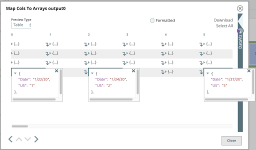
If you switch the Preview Type back to Table and click on a few cells in the last row, representing this same data, it lets you peer into this nested array structure.
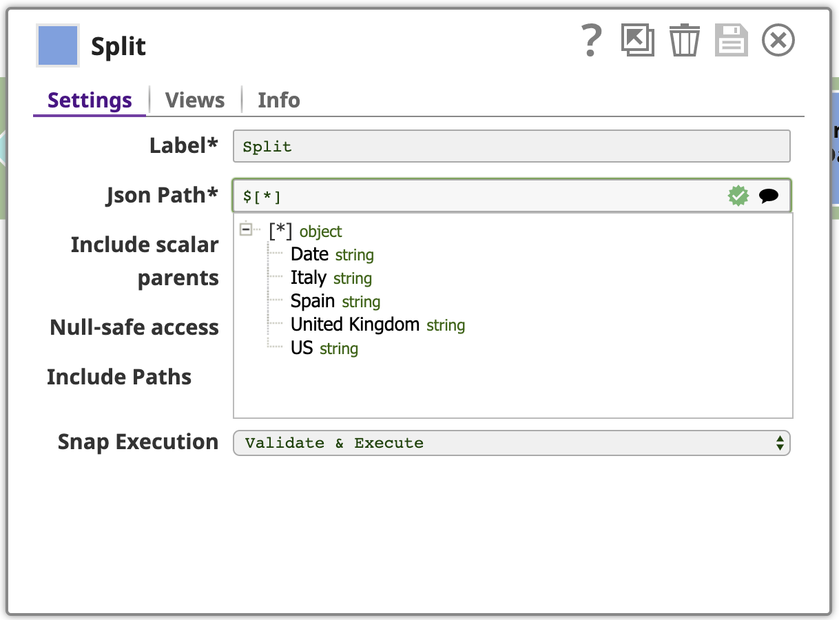
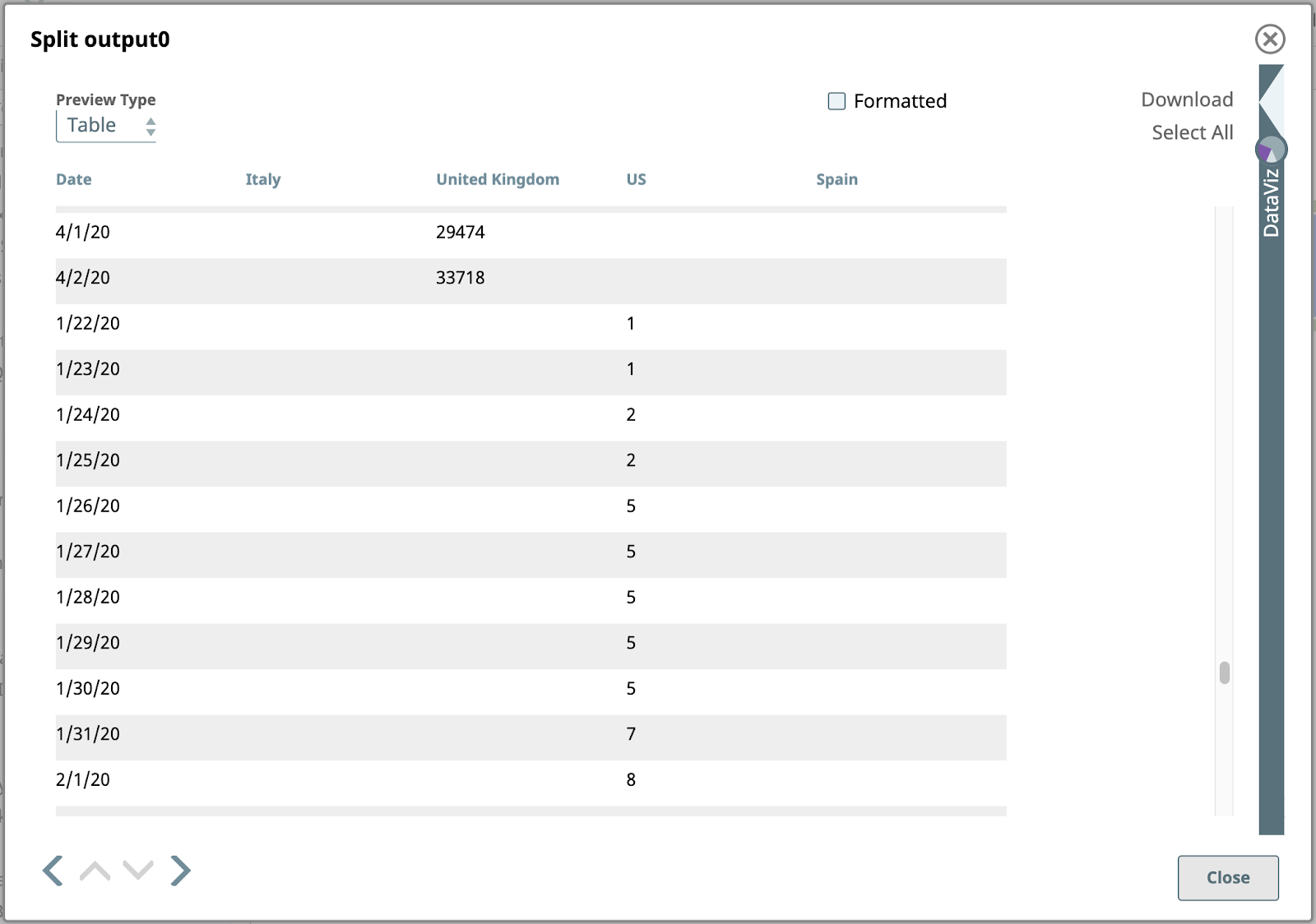
5. Split
As shown above, each input document to the next Snap in our pipeline is an array of objects. We want to split these arrays into their component objects. Use the JSON Splitter Snap with the Json Path setting configured with the path referencing the array elements that should be mapped as the output documents. Clicking the suggest icon at the right end of the Json Path field helps us do this. Clicking the top node in this tree sets the path to $[*].
Here is the output of the JSON splitter for the rows with US values:
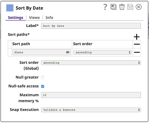
6. Sort By Date
Next, sort the data by Date. This is easy with the Sort Snap, configured as shown:
This is the sorted output:
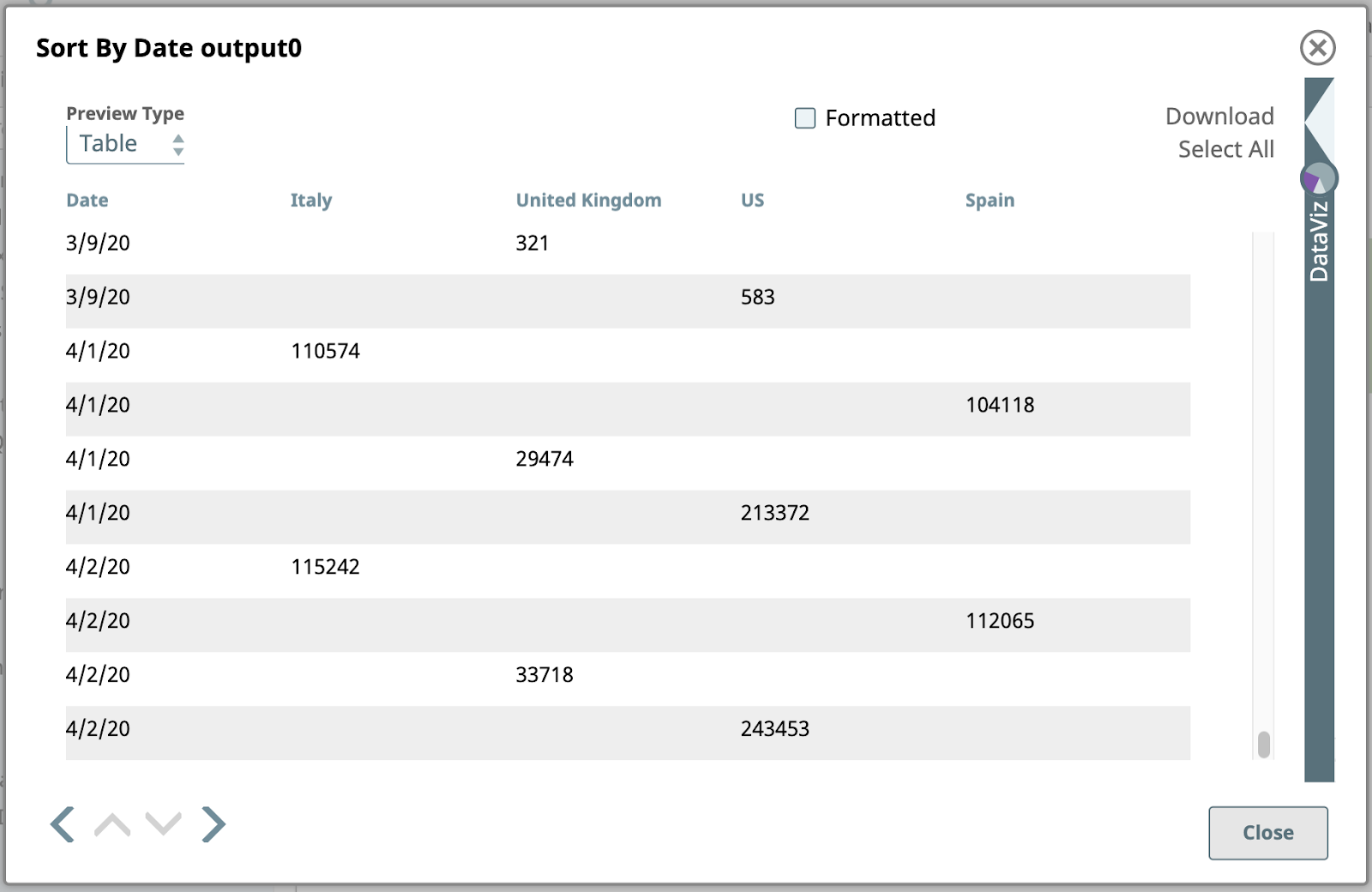
Note that the date values here are of string type, so they are sorted alphanumerically, without interpreting them as dates. This means “3/9/20” is at the end of the data for March. We could deal with that if we needed to, but we don’t. This output is perfectly adequate for our remaining steps.
7. Group By Date
Now that the documents are sorted by Date, we can use the Group By Fields Snap to group documents together by a field classification. Note, this will only work correctly if the data is, in fact, sorted.
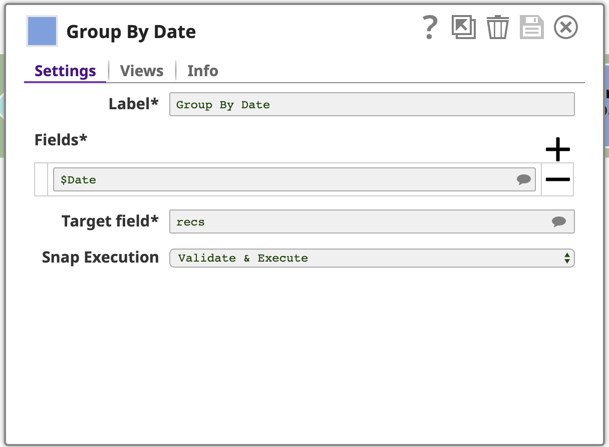
This Snap is configured with one or more Fields to group by, in this case, just the Date. The Snap will collect each group of input documents with the same Date field value and will output a single document containing the data from these input documents. The data is nested under an array in the output document, where the array is stored under a field named by the Target field setting: recs. To make this clear, let’s preview the output as JSON, here is the last page:
The last step in this pipeline is another Mapper.
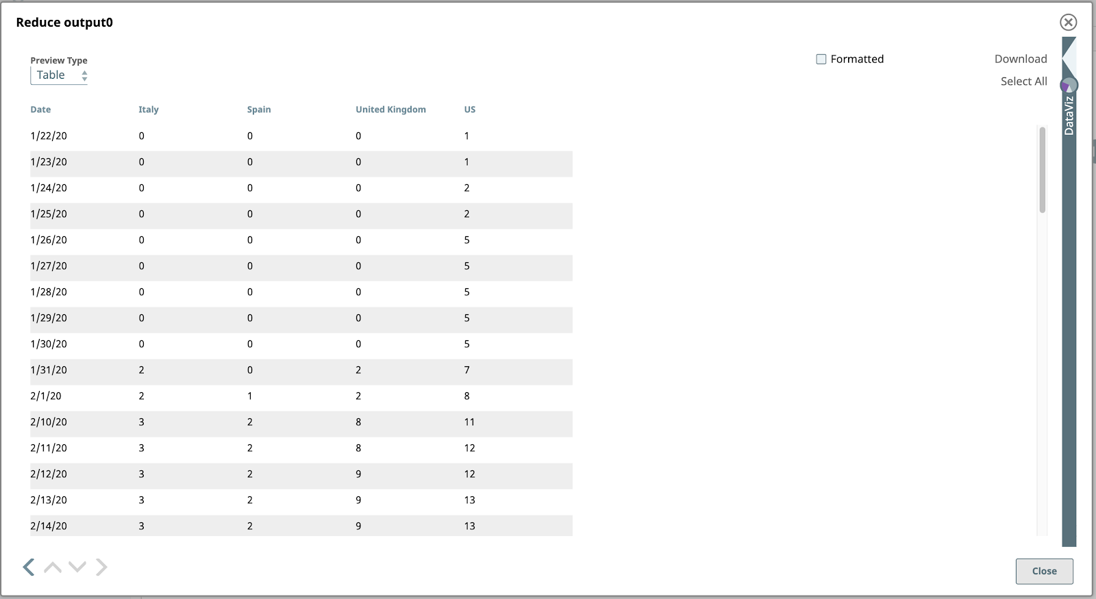
8. Reduce
You’ve already seen the map function of the expression language used in our last Mapper. This may ring a bell if you’re familiar with the MapReduce programming model at the heart of “Big Data” processing. Well, guess what? The SnapLogic expression language also has a reduce function, which we’ll use in our final Mapper. Here’s our configuration (with some side panels collapsed):
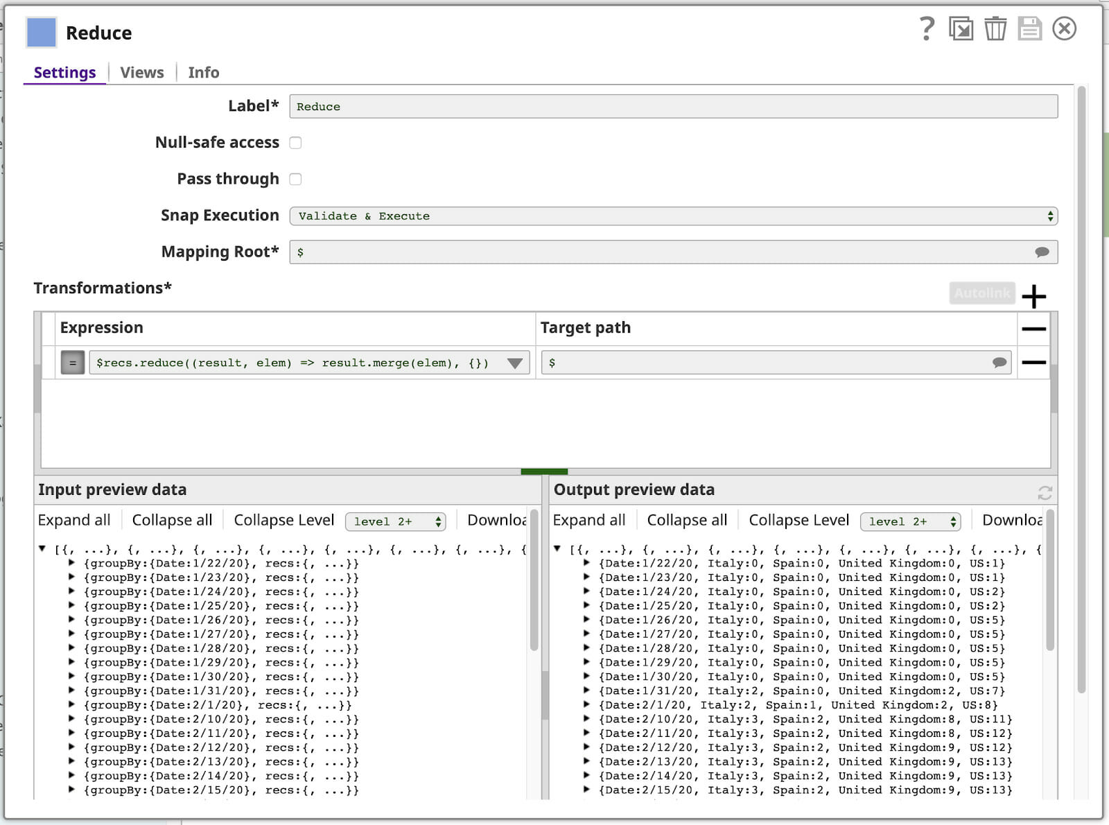
Let’s break down the expression:
$recs.reduce((result, elem) => result.merge(elem), {})
$recs is the array within each input document, which looks like this:
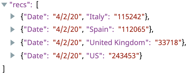
This contains everything we need for the output document.
.reduce(function, initialValue) will reduce this array to a single value using the given function, starting the iteration with the given initial value. Here, this function is expressed as a JavaScript lambda expression:
(result, elem) => result.merge(elem)
The function’s parameters are named on the left side of the => result and elem. The expression on the right is used to compute the result of the function. The reduce function will call this function once for every element in the array, with the output of each call serving as input to the subsequent call via the result parameter, and the next array element’s value via the elem parameter. The initialValue given to reduce is the value of the result param to use for the first iteration. In this case, we’re using the merge function to merge this array into a single object.
This will be easier to understand if we show each iteration:
| Iteration | Input: result | Input: elem | Output: result.merge(elem) |
| 1 | {} (the initialValue) | {“Date”, “4/20/20”, “Italy”: “115242”} | {“Date”, “4/20/20”, “Italy”: “115242”} |
|
2 |
{“Date”, “4/20/20”, “Italy”: “115242”} | {“Date”, “4/20/20”, “Spain”: “112065”} | {“Date”, “4/20/20”, “Italy”: “115242”, “Spain”: “112065”} |
|
3 |
{“Date”, “4/20/20”, “Italy”: “115242”, “Spain”: “112065”} | {“Date”, “4/20/20”, “United Kingdom”: “33718”} | {“Date”, “4/20/20”, “Italy”: “115242”, “Spain”: “112065”, “United Kingdom”: “33718”} |
|
4 |
{“Date”, “4/20/20”, “Italy”: “115242”, “Spain”: “112065”, “United Kingdom”: “33718”} | {“Date”, “4/20/20”, “US”: “243453”} | {“Date”, “4/20/20”, “Italy”: “115242”, “Spain”: “112065”, “United Kingdom”: “33718”, “US”: “243453”} |
On each iteration of reduce, another element of the array gets merged into the output object. Every element has the same Date value, so that stays the same after each iteration, but we end up with a single object that contains all of the country case counts for that date.
You can see the resulting output documents in the Output preview data panel in the lower-right corner of the Reduce Mapper shown above.
Visualize The Data
Let’s preview the output of the Reduce Mapper from the previous step.
Bingo! Our data finally looks chart-friendly. Let’s open the DataViz panel by clicking on the left-pointing arrow shape just above the DataViz label on the right side of the window. The panel expands to occupy the right half.
To see the final line chart, set the Chart Type to “Line Chart – Date as X axis”, X-axis to “Date”, and Key to Visualize to the country names you want visualized.
I hope this blog helped you gain a better understanding of powerful features within the SnapLogic platform that enable you to read and visualize COVID-19 data.
I hope for the best of luck to you and yours during this difficult time.
Stay healthy, stay safe!